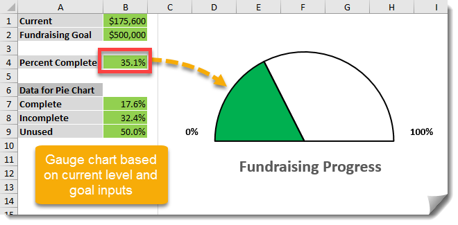
In a previous post I showed you How To View Actual Versus Target With A Thermometer Style Chart and in this post we’re going to look at how to display similar information in a gauge chart. Excel doesn’t have a gauge chart option, but we can use a pie chart to create something that looks like a gauge. In this example we’ll chart the current amount raised against a fundraising goal.
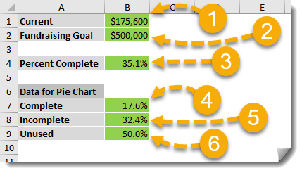
We’ll need to set up a few fields in our spreadsheet to start.
- Current – This will be the current amount that’s been raised so far to date.
- Fundraising Goal – This is the goal amount of the fundraising campaign.
- Percent Complete – This will be a formula =Current/Fundraising Goal and represents the percentage of the goal raised to date.
- Complete – This will be the portion of our pie chart that will represent our percent complete and will be given by the formula =MIN(50%,Percent Complete/2).
- Incomplete – This will be the portion of our pie chart that will represent our percent incomplete and will be given by the formula =50%-Complete.
- Unused – This will be a constant 50%. We want our chart to look like a half circle, so 50% of our pie chart will not be used. We will end up hiding this part of the chart by formatting it with no fill and no outline.
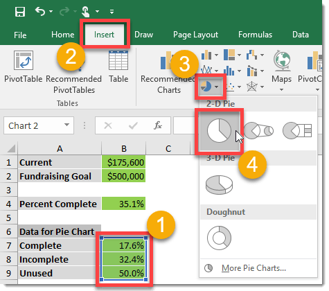
Insert a pie chart.
- Highlight the data for the complete, incomplete and unused percentages. They will add to 100% so that we have a full pie.
- Go to the Insert tab in the ribbon.
- Select the small Pie Chart icon from the Charts section.
- Select the 2D Pie Chart.
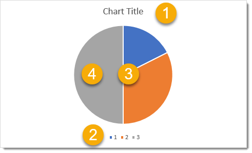
The result will not automatically look like a gauge, we will need to make some adjustments.
- We can change the title of the chart to something more meaningful like Fundraising Progress. Later we can also move it below the gauge.
- Delete the legend by clicking on it and pressing Delete.
- Right Click on the pie and select Format Data Series. You should see a new window pane with the heading Format Data Series on the right hand side. Change the Angle of first slice to 270 under the three vertical bar icon.
- Left Click on the 50% pie slice and you should see the Format Data Series change to Format Data Point. Under the paint can icon change the setting to No fill and No line. Similarily, you can change the colour of the two other slices as desired.
Add some labels such as 0% and 100% as gauge marks using a text box and we now have something that looks like a gauge that’s been constructed out of a pie chart! It’s a cool pie chart hack that’ll add some style to your dashboards.


 👉 Find out more about our Advanced Formulas course!


0 Comments