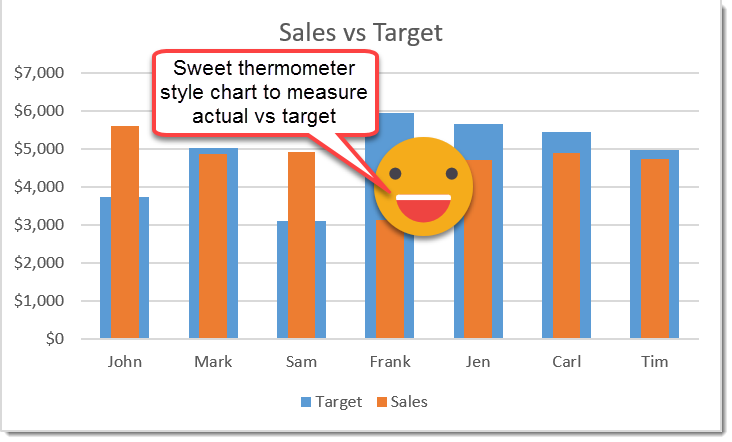
If you want to view your performance versus a target for some metric like sales then a thermometer style chart is a great way to do this.
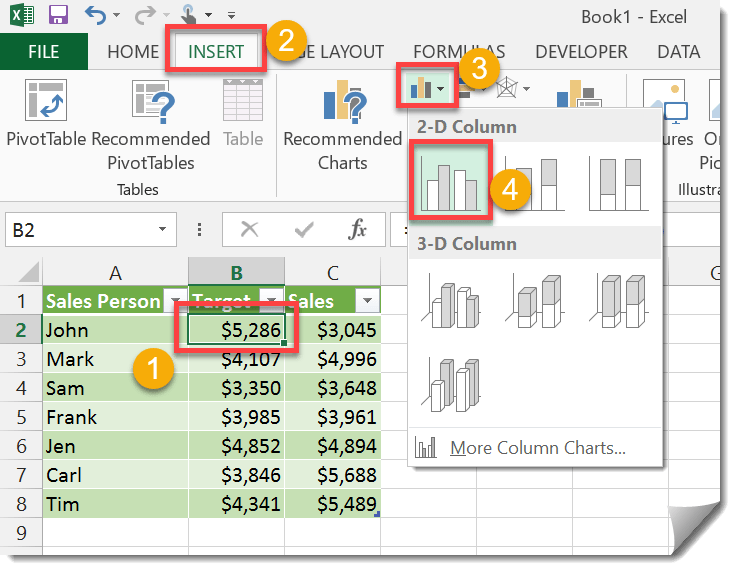
In this example we have a table with columns for the sales person, their target sales and the actual sales they had. We will create a 2D bar chart for this data.
- Place the Active Cell cursor somewhere in your data.
- Go to the Insert tab.
- From under the Charts section, press the Bar Chart icon.
- Select the 2D Bar Chart from the menu.
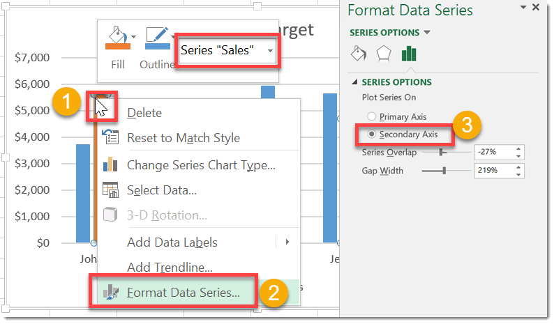
Add your performance data to the secondary axis (in this case the sales data).
- Right click on one of the sales bar columns in the chart.
- Select Format Data Series from the drop down menu.
- In the Format Data Series window, select the Secondary Axis radio button.
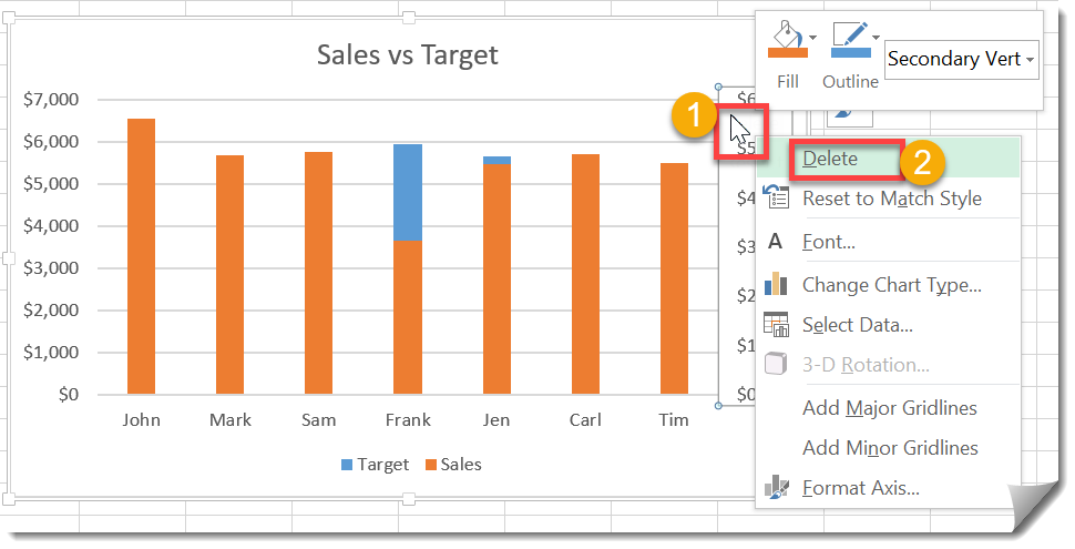
Delete the resulting secondary axis in the chart.
- Right click on the secondary axis.
- Select Delete from the menu.
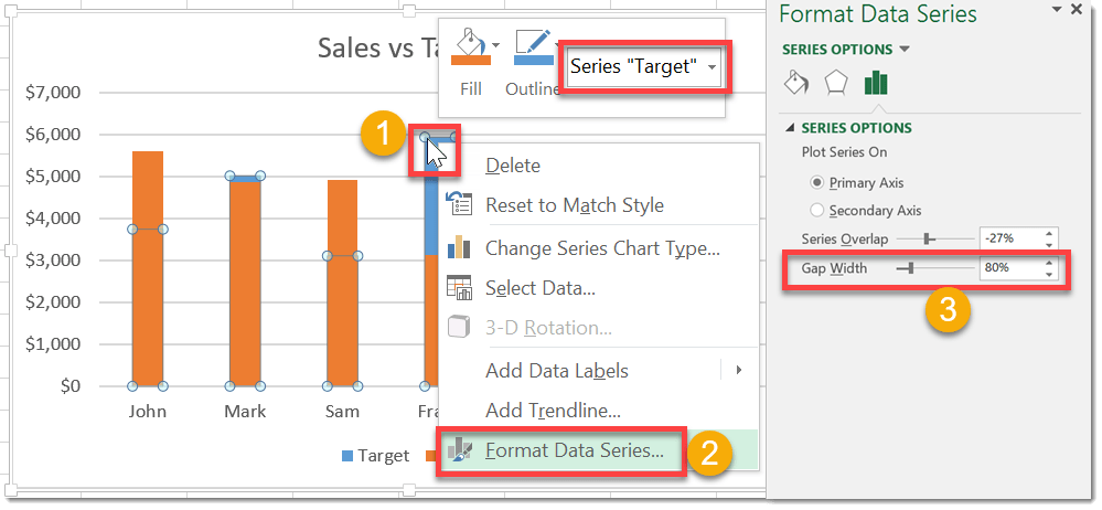
Format the Target data series.
- Right click on one of the Target bar columns in the chart.
- Select Format Data Series from the menu.
- Adjust the Gap Width value until the desired thermometer result. I’ve set it to 80%.
The result is an easy to read performance versus target thermometer style chart.
 👉 Find out more about our Advanced Formulas course!


Instead of having all the sales reps in one graph, how do you add a drop down box to select individual sales reps?