Are you wondering how to make a scatter plot in Excel? Follow along with this thorough tutorial to learn this must-have data visualization skill.
A scatter plot helps you to show the relationship between two sets of numerical or quantitative analysis values. It’s used abundantly to visualize scientific, engineering, and statistical data on an XY chart where both axes contain values.
Microsoft Excel offers multiple easy ways to draw and share scatter or xy plots. Follow along with this tutorial until the end to practice the easiest techniques to create 2D and 3D scatter plots.
Using the Quick Analysis Tool

Suppose, you’d like to analyze the statistical relationship between the above dataset of store visitors and sales using an Excel scatter plot. You can use the Quick Analysis tool from the right-click menu. Alternatively, it’ll also show up if you select the input dataset in newer Excel editions, like Excel 2021, Excel 365, Excel for the web app, etc.
Let’s consider, you’re using Excel for Microsoft 365 desktop app. Open the worksheet containing the input data for the XY plot. Select the entire dataset. The Quick Analysis tool prompt will show up in the bottom right corner.

Click on the Quick Analysis tool icon or press Ctrl + Q to access the Quick Analysis tool user interface.

Now, navigate to the Charts tab and click on the Excel Scatter plot button.

Excel will automatically insert a scatter chart with default settings (Bounds, Units, and Label Position) for the X and Y axes. The XY chart also includes an automatic line for easier comparison of two sets of values.
A drawback of this method is the Quick Analysis tool isn’t available on earlier Excel editions like Excel 2010, Excel 2007, etc.
Using the Insert Scatter or Bubble Chart Command
The default location for all chart tools including Excel scatter plot is the Charts commands block of the Insert tab.
If you’re using Excel 2013 or newer, you’ll get the Recommended Charts command button. It takes you to an elaborate list of XY plots.

So, select the target dataset and click on the Insert Scatter drop-down menu. Choose any of the following scatter chart types:
- Scatter (only markers)
- Scatter with Smooth Lines and Markers
- Scatter with Smooth Lines
- Scatter with Straight Lines and Markers
- Scatter with Straight Lines

I picked the Scatter with Smooth Lines and Markers option. You can see the result above.

If there’s a third set of values to be plotted in the same graph, you can try the bubble chart style as well. It’s available in Insert > Insert Scatter > Bubble.

You can choose from any of the following two bubble chart models:
- Bubble
- 3D Bubble

For instance, if I create a bubble chart for the above dataset, the values in the Sales and Visitors columns will be used to plot the markers for the Y and X axes. The Profits column values will define the bubbles’ diameters in the chart.
Using a Keyboard Shortcut

After selecting the target dataset, press Alt + F1 to insert the default column chart in the active worksheet.

Click on the chart populated by Excel to access the Chart Design tab in the ribbon.
Click on the Change Chart Type command button in the Type block.

The Change Chart Type dialog box will show up with All Charts as the selected tab.
Click on the left-side navigation panel’s X Y (Scatter) category.

On the right side, you should see the preview of the default scatter model with only markers.
You can change the scatter plot type on the top and choose an appropriate graph from the preview. Click OK to apply the changes you’ve made.

Excel will change the column chart to scatter plot instantly.
Adding a New Data Series

Suppose, you already have the above scatter plot in your Excel worksheet.
If you wish to add a third set of values in the same chart, select the existing graph.

Paste the new data series in column C or any other column to the right of the existing dataset.

Right-click on it and choose Select Data from the context menu.
The Select Data Source dialog box will pop up.

Delete the existing cell range reference of the Chart data range field.

Select the new cell range from the worksheet. Click OK save.

You should now see two sets of markers on the scatter chart.
Click on the chart again and select Change Chart Type from the Type commands block in the Chart Design tab.

Choose Combo from the left-side navigation pane in the Change Chart Type dialog.
You should see the series names and corresponding chart types on the right-side preview pane.
Click on the drop-down menus for both the series and choose Scatter.

Checkmark the checkbox for Secondary Axis for any of the data series. For example, checking the Secondary Axis for Profits would show as the additional series axis labels on the right side of the chart.

The final chart will look like the one shown above.
📒 Read More: 6 Ways to Add a Secondary Axis in Microsoft Excel
Using Excel VBA
You can also create the default or a custom scatter plot using the Excel VBA tool. It doesn’t require you to go through VBA programming courses. Just use the scripts I’ve shared below to create cool VBA macros that can magically insert XY plots.
Firstly, follow along with the tutorial below to learn the techniques to create a VBA macro using a VBA program code:
📒 Read More: How To Use The VBA Code You Find Online
If you’re ready, check out the scripts and their functions outlined below
Default Scatter Plot in Excel Using VBA
The following script lets you create the default scatter plot. It’s similar to the one you create using the Quick Analysis tool or the Insert Scatter command in the Excel ribbon menu.

Sub CreateScatterPlot()
    Dim YRange As Range
    Dim XRange As Range
    Dim ChartTitle As String
    Dim AddAxisTitles As Boolean
    Dim XAxisTitle As String
    Dim YAxisTitle As String
    Dim MyChart As ChartObject

    ' Select Y-axis data series
    On Error Resume Next
    Set YRange = Application.InputBox("Select Y-axis data series:", Type:=8)
    On Error GoTo 0
    If YRange Is Nothing Then Exit Sub

    ' Select X-axis data series
    On Error Resume Next
    Set XRange = Application.InputBox("Select X-axis data series:", Type:=8)
    On Error GoTo 0
    If XRange Is Nothing Then Exit Sub

    ' Custom chart title
    If MsgBox("Do you want to add a custom chart title?", vbYesNo) = vbYes Then
        ChartTitle = InputBox("Enter custom chart title:")
    End If

    ' Axis titles
    If MsgBox("Do you want to add axis titles?", vbYesNo) = vbYes Then
        AddAxisTitles = True
        XAxisTitle = YRange.Cells(1, 1).Value
        YAxisTitle = XRange.Cells(1, 1).Value
    End If

    ' Create the chart
    Set MyChart = ActiveSheet.ChartObjects.Add(Left:=100, Width:=375, Top:=75, Height:=225)
    With MyChart.Chart
        .ChartType = xlXYScatter
        .SetSourceData Source:=Union(XRange, YRange)
        .HasTitle = True
        .ChartTitle.Text = ChartTitle
        If AddAxisTitles Then
            .Axes(xlCategory, xlPrimary).HasTitle = True
            .Axes(xlCategory, xlPrimary).AxisTitle.Text = XAxisTitle
            .Axes(xlValue, xlPrimary).HasTitle = True
            .Axes(xlValue, xlPrimary).AxisTitle.Text = YAxisTitle
        End If
    End With
End Sub

After creating the macro, press Alt + F8 to launch the Macro dialog box.
There, select the CreateScatterPlot macro and hit Run.
The VBA script will start populating a series of input boxes and confirmation pop-ups to guide you through entering data and formatting the output chart. Find below the pop-ups and their functionalities:

- Use your mouse to select the data series column for the Y axis.

- An input box so you can enter the X-axis values by selecting the column using a mouse.

- If you wish to add a custom chart title, click Yes in this notification box.

- This is the input box where you should type in the chart title.

- Click Yes if you want to add axis titles. Excel will use the column headers to populate the titles.

Find above a scatter plot created using this VBA script.
Plotting Three Sets of Data Series
You can create a Combo scatter chart using three sets of data series using the following script:

Sub CreateComboScatterPlot()
    Dim oChartObj As ChartObject
    Dim oChart As Chart
    Dim rXValues As Range
    Dim rSeries1 As Range
    Dim rSeries2 As Range

    ' Show input boxes to select data ranges
    Set rXValues = Application.InputBox("Select X-axis data range:", Type:=8)
    Set rSeries1 = Application.InputBox("Select first data series range:", Type:=8)
    Set rSeries2 = Application.InputBox("Select second data series range:", Type:=8)

    ' Create a new chart
    Set oChartObj = ActiveSheet.ChartObjects.Add(Left:=10, Top:=10, Width:=600, Height:=300)
    Set oChart = oChartObj.Chart

    ' Set chart type for series
    oChart.ChartType = xlXYScatter
    oChart.SeriesCollection.NewSeries
    oChart.SeriesCollection(1).XValues = rXValues
    oChart.SeriesCollection(1).Values = rSeries1
    oChart.SeriesCollection(1).MarkerStyle = xlMarkerStyleCircle ' Set marker style for series 1

    oChart.SeriesCollection.NewSeries
    oChart.SeriesCollection(2).XValues = rXValues
    oChart.SeriesCollection(2).Values = rSeries2
    oChart.SeriesCollection(2).MarkerStyle = xlMarkerStyleSquare ' Set marker style for series 2

    ' Add secondary axis for the second series
    oChart.ApplyCustomType ChartType:=xlXYScatter
    oChart.SeriesCollection(2).AxisGroup = 2

    ' Add secondary axis labels
    oChart.Axes(xlValue, xlSecondary).HasTitle = True
    oChart.Axes(xlValue, xlSecondary).AxisTitle.Text = "Secondary Y-axis"

    ' Add a chart title
    oChart.HasTitle = True
    oChart.ChartTitle.Text = "Combo Scatter Plot"

    ' Display the chart
    oChartObj.Select
End Sub
When you execute the VBA macro created from the above script, a cascade of pop-ups will walk you through the process. I’ve listed these below:

- Use your mouse cursor to choose the data column for the X-axis.

- In the next prompt, you’ll need to enter the cell range for the first data series.

- Similarly, enter the cell range for the second data series in the third prompt.
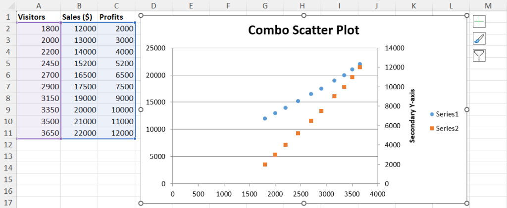
Excel VBA will populate the scatter chart as instructed.
Useful Customizations for a Scatter Plot
You might need to customize various technical elements of the scatter chart using the Format Chart Area navigation pane.

Firstly, you must click on the chart to get the Format Chart Area tool. It should be on the right.

Click the Chart Options drop-down menu and choose Horizontal (Value) Axis.

Go to the Axis Options menu and expand the Axis Options list of items.
From here, you can modify the Bounds and Units to make the chart axis labels relevant to the markers.

For example, in the above chart, the markers are far away from the axis cross sections because Bounds and Units haven’t been customized appropriately.

So, changing the Bounds Minimum to 1,500 points should fix the spread of the X-axis.

Similarly, you can adjust the Bounds of the Y-axis. Just navigate to the Vertical (Value) Axis menu in the Format Axis navigation panel. Then, follow the same steps to edit Bounds Minimum from Axis Options.

To add a trendline and its equation, click on the chart to get the Chart Elements button. It’s the Plus (+) sign in the top right corner.
Click Chart Elements and checkmark the check box for Trendline.

Now, double-click on the trendline to open the Format Trendline navigation panel. Select the following options:
- Display Equation on chart
- Display R-squared value on chart
Conclusions
So far, you’ve learned and practiced the best methods to make a scatter chart in Microsoft Excel.
In addition, you’ve learned how to customize a scatter plot to fit your data visualization requirements.
Which method would you like to recommend? Comment below!


 👉 Find out more about our Advanced Formulas course!


0 Comments